Tropical Elegance: Crafting the Visual Identity of Coco Slow


The logo for "Coco Slow," a boutique apartment rental service on Fuerteventura, was designed to reflect the tranquil and tropical essence of the island. The aim was to create a visual identity that embodies relaxation, natural beauty, and the laid-back lifestyle that guests can expect during their stay.
Design Process
- Understanding the Brand: The design process began with understanding the core values of “Coco Slow”—calmness, elegance, and the tropical charm of Fuerteventura.
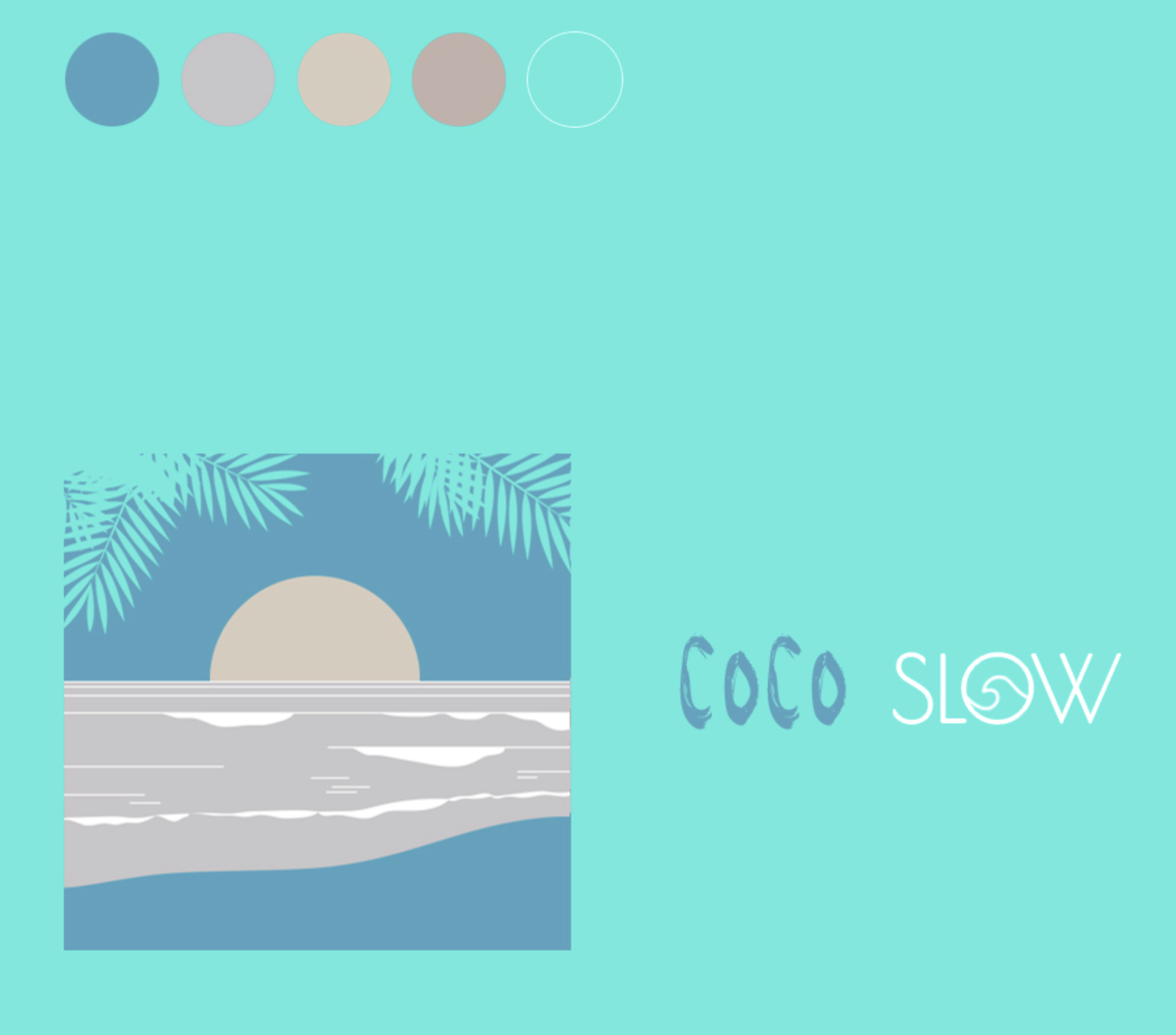
- Concept Development: Various concepts were sketched, focusing on incorporating elements like palm trees, ocean waves, and a minimalist aesthetic to represent the island’s serene environment.
- Typography Selection: A clean and modern typeface with a touch of warmth was chosen to convey professionalism while maintaining a relaxed vibe.
- Color Palette: Soft earthy tones, ocean blues, and sandy neutrals were selected to evoke feelings of peace, nature, and coastal beauty.
- Final Design: The final logo combined organic shapes and subtle tropical motifs, creating a design that feels luxurious yet welcoming.
Outcome
The finished logo perfectly captures the essence of “Coco Slow.” It serves as a memorable and professional representation of the apartment rental business, resonating with travelers looking for a serene escape on Fuerteventura.
Contact us
hola@solcanarias.es
+34 642 198 048
www.solcanarias.es
connect
Instagram
Facebook
